
Offered by
Portuguese Ball Hockey Association
About this shop
A Loja - Portuguese Ball Hockey Association's Shop
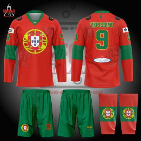
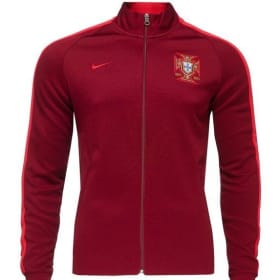
Traditional Red Jersey
$55
TRADITIONAL RED KIT
Masters 2025
The Standard. The Symbol. The Nation.
There are alternates… and then there is the jersey that defines you.
The Traditional Red Kit is Portugal in its purest competitive form — bold, unmistakable, and built on history.
🔴 THE FOUNDATION: PORTUGUESE RED
The dominant red base commands attention the moment the team steps onto the floor. It represents passion, sacrifice, and the fire that fuels Portuguese competition worldwide.
This is not a trend color.
This is identity.
🛡 THE NATIONAL EMBLEM
Centered proudly on the chest sits the full Portuguese national shield within the armillary sphere — a symbol synonymous with exploration, strength, and sovereignty.
It is heritage made modern.
It is pride worn front and center.
🟢 GREEN POWER BANDS
Strong green sleeve bands balance the red body, creating instant visual recognition. The contrast is bold, clean, and rooted in the national flag.
From stands to livestream screens, there is no mistaking who has taken the floor.
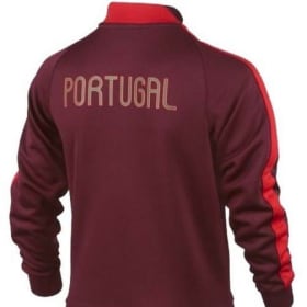
🔢 BACK DETAIL – NAME & NUMBER
On the reverse:
The nameplate arches confidently above a strong, gold-outlined number. The typography is sharp, international, and built for visibility under arena lights.
Above the name sits a subtle Portuguese flag detail — a reminder that every player carries more than a number.
They carry a country.
🩳 COMPLETE MATCH SET
The kit is finished with:
- Deep green performance shorts featuring the national crest
- Matching red-and-green socks with shield detailing
- Gold accents tying the entire look together
Balanced. Cohesive. Elite.
🌍 BUILT FOR INTERNATIONAL STAGE
Engineered for Masters-level competition:
- Lightweight, breathable performance fabric
- Athletic cut for mobility and speed
- Durable sublimation for long-lasting color integrity
- Climate-ready construction for global tournaments
Whether competing in Bermuda, Europe, or North America — this jersey is built to perform.
⚔ THE MESSAGE
The Traditional Red Kit is not an alternate.
It is the heartbeat of Portugal Ball Hockey.
When the team steps onto the court in red, they step in united — representing history, community, and generations who built the foundation of the program.
Red means ready.
Red means relentless.
Red means Portugal.
Portugal. Period.

Traditional White Jersey
$55
TRADITIONAL WHITE KIT
Masters 2025
Purity. Precision. Presence.
If red is the fire — white is the statement.
The Traditional White Kit delivers the same iconic Portuguese identity, reimagined in a clean, commanding form that elevates every detail of the design.
⚪ THE FOUNDATION: COMMANDING WHITE
The crisp white base represents discipline, clarity, and composure under pressure. It allows every national element — green, red, and gold — to stand out with amplified intensity.
White doesn’t whisper.
It dominates differently.
🛡 THE NATIONAL EMBLEM
Centered boldly on the chest remains the Portuguese shield within the armillary sphere — vibrant, unmistakable, and proud.
Against the white canvas, the crest becomes even more striking. The reds deepen. The greens intensify. The gold frame radiates.
Heritage has never looked sharper.
🟢 GREEN POWER BANDS
The signature green sleeve bands cut confidently across the arms, creating powerful contrast against the white body. The balance of color remains authentically Portuguese while feeling elevated and modern.
Clean lines. Strong identity. Immediate recognition.
🔢 BACK DETAIL – NAME & NUMBER
On the reverse:
VERISSIMO – 9
The gold-outlined green numbering becomes even more pronounced against the white field. The nameplate sits bold and clear, designed for visibility and authority.
Above it, the subtle Portuguese flag detail reinforces the meaning behind the jersey:
Every shift represents the nation.
🩳 COMPLETE MATCH SET
Paired with:
- Deep green performance shorts featuring the national crest
- Coordinated red-and-green socks with shield detailing
- Gold accents tying the entire kit together
The white top sharpens the entire visual package — refined yet fearless.
🌍 BUILT FOR THE INTERNATIONAL STAGE
Constructed for elite Masters competition:
- Lightweight, breathable high-performance fabric
- Athletic cut engineered for movement
- Durable sublimation preserving vibrancy and detail
- Tournament-ready for global competition
From Bermuda to Europe and beyond, this kit carries Portugal with clarity and confidence.
⚔ THE MESSAGE
The Traditional White Kit represents composure under pressure.
It is controlled intensity.
It is confidence without noise.
It is national pride presented with precision.
Where red brings fire, white brings focus.
And when Portugal takes the floor in white, the message is simple:
We are prepared.
We are united.
We are Portugal.
Portugal. Period.

3rd Jersey- Cream with PBHA Logo Bermuda Masters
$55
2025 Bermuda Third Jersey
Heritage. Experience. Legacy.
For the Masters squad competing in Bermuda 2025, this third jersey wasn’t just an alternate — it was a statement of identity.
Built in a refined cream base with bold Portuguese striping, this kit represents seasoned competitors carrying tradition onto the international stage.
🦅 THE CREST: PBHA FRONT AND CENTER
Dominating the chest is the full-color PBHA rooster crest, sublimated with depth and authority. The green and red wings frame the national shield — a symbol of pride, resilience, and representation.
This isn’t a subtle mark.
It’s leadership embedded into fabric.
🧵 THE BASKETWEAVE HERITAGE DETAIL
Woven subtly throughout the background and prominently featured on the shorts is the traditional Basketweave crest pattern — a nod to classic Portuguese design elements and long-standing federation identity.
The basketweave detailing represents:
- Structure
- Strength
- Interconnection
- Generational continuity
For the Masters team, that symbolism matters. Experience is woven, not printed.
🇵🇹 TRADITIONAL NATIONAL STRIPING
The hem striping in green, red, and gold anchors the jersey in unmistakable Portuguese identity. Balanced and bold, it frames the uniform with purpose and pride.
Matching striping on the socks completes a fully unified look from crest to calf.
💪 BUILT FOR COMPETITION
Engineered for international play, the jersey features:
- Lightweight performance fabric
- Breathable construction for warm climates like Bermuda
- Athletic cut for elite movement
- Durable sublimation to preserve intricate background detailing
The Masters division demands composure. The jersey reflects it.
🌍 THE MESSAGE – BERMUDA 2025
This third kit represents more than an alternate colorway.
It represents a generation of players who have built the foundation of Portugal Ball Hockey. Players who carry the crest with pride and understand what it means to compete internationally.
The basketweave speaks to legacy.
The rooster speaks to courage.
The striping speaks to nation.
In Bermuda, the Masters didn’t just wear a jersey.
They wore history.
Portugal. Period.

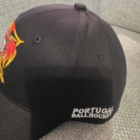
PBHA Cap
$40
The PBHA Logo Hat represents a team establishing itself on the world stage.
Disciplined. Focused. United.
This is what confidence looks like before the puck drops.
This is what belief looks like when no one is watching.
Portugal Ball Hockey isn’t here to participate.
They’re here to build
⚫ THE DESIGN: CONTROLLED POWER
- Deep Black Crown – Strong, confident, professional.
- Full-Color Embroidered PBHA Crest – Precision stitched. Raised thread. Premium finish.
- “PORTUGAL BALL HOCKEY” Embroidered on the Side – Clean white stitching for contrast and presence.
- Structured Front Panels – Sharp profile. Elite look.
- Adjustable Snapback Strap – Game-ready fit for players and supporters alike.
This isn’t loud.
It’s intentional.
🧵 PREMIUM EMBROIDERY
The crest isn’t printed — it’s stitched.
Every thread represents tradition, discipline, and pride.
The embroidered finish gives it:
- Texture
- Depth
- Durability
- Championship presence
It holds its shape. It holds its message.
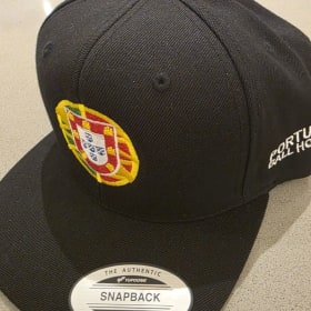

Portugal Ball Hockey Crest Hat
$40
PORTUGAL BALL HOCKEY CREST CAP
Simple. Classic. Proud.
The Portugal Ball Hockey Crest Cap delivers a clean and timeless look that represents both national heritage and the growing global presence of Portuguese ball hockey.
🛡 FRONT CREST – PORTUGUESE HERITAGE
Front and center sits the iconic Portuguese national shield set within the historic Armillary Sphere, one of Portugal’s most recognizable national symbols.
Beautifully embroidered in vibrant red, green, gold, white, and blue, the crest represents centuries of exploration, resilience, and national pride. The detailed stitching gives the emblem depth and texture, creating a premium look that stands out against the black crown.
This is more than a logo — it’s Portugal’s story.
🧢 CLASSIC BLACK FOUNDATION
The hat features a structured all-black crown and bill, creating the perfect backdrop for the colorful crest to stand out boldly. The neutral base makes it easy to wear anywhere — whether at the rink, at events, or representing the team in everyday life.
Clean. Sharp. Timeless.
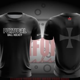
Black Heritage Performance Tee - Bermuda Masters
$35
Black Heritage Performance Tee
Strength isn’t always loud. Sometimes it’s historic.
The Portugal Ball Hockey Black Heritage Performance Tee blends modern athletic performance with one of the most powerful symbols in Portuguese history — the Templar Cross.
⚔️ A SYMBOL OF LEGACY
Featured boldly across the back, the Templar Cross represents courage, faith, and resilience — values deeply rooted in Portugal’s past. From the Age of Discovery to global influence across continents, Portugal’s story is one of fearless pursuit and unshakable identity.
That same mindset now steps onto the ball hockey floor.
This isn’t decoration.
It’s heritage worn with purpose.
⚫ CLEAN. COMMANDING. CONFIDENT.
- Deep black performance base for a strong, professional presence
- “PORTUGAL BALL HOCKEY” front chest wordmark in bold white
- Oversized tonal Templar Cross on the back for a subtle but powerful statement
- Minimalist design with maximum attitude
The cross isn’t loud in color — it’s strong in meaning.
💨 BUILT FOR PERFORMANCE
Crafted from lightweight, moisture-wicking Dri-Fit performance fabric, this shirt is designed for:
- High-intensity training
- Travel and team arrivals
- Warm-ups at international competition
- Off-floor representation
Breathable. Athletic cut. Game-ready feel.

Age of Discovery Heritage Performance Tee -Bermuda Masters
$35
Age of Discovery Heritage Performance Tee
Before Portugal competed on the world stage in sport, it led the world across oceans.
The Age of Discovery Heritage Performance Tee is a tribute to that fearless spirit — blending elite athletic performance with one of the most defining eras in Portuguese history.
⛵ A SYMBOL OF EXPLORATION
Subtly embedded into the fabric design are the Caravelle ships — the iconic vessels that carried Portuguese explorers beyond the horizon during the 15th and 16th centuries.
These ships changed global history.
They represent:
- Courage to venture into the unknown
- Strategic innovation
- Discipline and preparation
- National pride carried across continents
Now, that same mindset fuels Portugal Ball Hockey as it establishes itself at international competition.
Different ocean. Same ambition.
⚪ CLEAN. CLASSIC. COMMANDING.
- Refined cream performance base for a heritage-inspired aesthetic
- Deep blue detailing on collar and sleeve trim
- Portugal crest positioned proudly on the chest
- Player number centered for professional presence
- Custom name and number layout on the back
- Subtle all-over ship graphic woven into the design
The caravels are not loud — they’re deliberate. A reminder that greatness is built over time.
💨 ELITE PERFORMANCE BUILD
Engineered with lightweight, moisture-wicking Dri-Fit performance fabric, this tee is built for:
- International warm-ups
- Team travel
- Championship preparation
- Representing Portugal off the floor
Athletic fit. Breathable construction. Game-ready comfort.
🌍 A NATION OF BUILDERS
Portugal didn’t wait for opportunity — it sailed toward it.
The Age of Discovery was about vision, bravery, and expanding boundaries. This shirt reflects a program doing the same in ball hockey — stepping into global competition with confidence and purpose.
The caravels once crossed oceans.
Now Portugal crosses into new competitive territory.
THE MESSAGE
History doesn’t hold you back.
It pushes you forward.
Portugal Ball Hockey carries centuries of ambition into every shift, every game, every World Championship appearance.
Explorers then.
Competitors now.
Portugal. Period.

100th Anniversary Portugal Jacket (Small to XL sizes)
$40
- 2014 Nike Portugal 100-Year Anniversary Jacket, featuring a 1914-2014 design honoring the Federação Portuguesa de Futebol (FPF).
- 100% polyester, full-zip jackets
- Design: Features specialized crests, designed for the FIFA World Cup year (2014).
- Features: Dri-FIT technology, zippered pockets, and lightweight material.


OPEN Warm Up 2026-Black
$35
BLACKOUT WORLD CAMPAIGN
One Nation. One Crest. One Mission.
When you step onto the world stage, you don’t whisper your arrival — you make a statement.
The new Portugal Ball Hockey Blackout Dri-Fit Performance Tee is built for teams chasing respect at the World Championships. It’s not just apparel. It’s identity.
⚫ THE DESIGN: POWER IN SIMPLICITY
- Bold Black Base – Clean. Dominant. Unapologetic.
- Subtle Cross Striping (Front & Back) – A strong, structured design that represents unity and discipline.
- Monochrome Rooster Crest – A modern, battle-ready symbol of Portuguese pride.
- Minimal Trim. Maximum Attitude.
- Player number placement for a sharp professional look.
This is the kit of a program ready to rise.
💨 PERFORMANCE MATTERS
- Premium Dri-Fit moisture-wicking fabric
- Lightweight, breathable construction
- Built for high-tempo ball hockey
- Game-ready fit for elite competition
Stay cool under pressure. Stay locked in during the biggest moments.

Black Edition Jersey
$55
PORTUGAL BALL HOCKEY – BLACK EDITION KIT
Power. Identity. Legacy.
The Black Edition Portugal Ball Hockey kit represents strength, confidence, and modern Portuguese pride on the international stage. Designed to command attention, this uniform blends traditional national symbolism with a bold contemporary look.
⚫ THE BLACK FOUNDATION
The deep black base creates a powerful visual presence, allowing Portugal’s iconic national colors to stand out with striking intensity. Clean, sleek, and intimidating, the black jersey symbolizes resilience and determination — the mindset of a team ready for global competition.
🦅 THE PBHA ROOSTER CREST
At the heart of the jersey sits the Portugal Ball Hockey Association rooster crest, a symbol deeply tied to Portuguese culture and identity. The rooster carries the national shield proudly on its chest, combining tradition and strength into one powerful emblem.
Rendered in vibrant red, green, gold, and white, the crest stands boldly against the black fabric, representing pride, courage, and the spirit of Portugal.
🛡 SUBTLE HERITAGE DETAILS
Throughout the jersey and shorts, the historic Portuguese Armillary Sphere and shield pattern appear subtly within the background fabric. These tonal graphics add depth and heritage without overpowering the design, honoring Portugal’s history of exploration and global influence.
🔢 PLAYER IDENTITY
The back of the jersey features the player name and number in bold Portuguese colors:
Outlined in green and red, the numbering ensures strong visibility while maintaining the national color palette. Above the nameplate sits the Portuguese flag, reinforcing that every player represents more than a team — they represent a nation.
🇵🇹 COMPLETE NATIONAL KIT
The uniform is paired with:
- Black performance shorts featuring the Armillary Sphere national crest
- Coordinated black socks with the PBHA rooster emblem
- Green and red striping across the waist and socks tying the entire look together
Every piece of the kit works together to create a unified Portuguese identity.
⚙ BUILT FOR COMPETITION
Constructed with high-performance athletic fabric, the uniform provides:
- Lightweight breathable material
- Full mobility for elite play
- Durable sublimated graphics
- Long-lasting tournament performance
Designed for the speed and intensity of international ball hockey.
🌍 THE MESSAGE
The Black Edition jersey represents the modern era of Portugal Ball Hockey — proud of its roots while pushing forward on the world stage.
It is bold.
It is confident.
It is unmistakably Portuguese.
When Portugal steps onto the floor wearing black, the message is clear:
Portugal is here to compete.
Portugal. Period. 🇵🇹


The Crest Hoodie
$80
HERITAGE CREST HOODIE
Tradition in the front. History on the back. Pride everywhere.
The Team Portugal Ball Hockey Heritage Crest Hoodie blends modern performance apparel with the deep cultural identity of Portugal. Designed as a fully sublimated performance hoodie, it delivers vibrant detail, durability, and comfort while showcasing the symbols that define Portuguese ball hockey.
🦅 FRONT – THE ORGANIZATION CREST
The centerpiece of the hoodie is the Portugal Ball Hockey Association rooster crest, proudly displayed on the chest. The iconic rooster carries the Portuguese national shield, symbolizing courage, pride, and the enduring spirit of Portugal.
Below the crest, the words “Team Portugal Ball Hockey” reinforce the identity of the organization and the growing international presence of the program.
Rendered in rich red, green, gold, and white, the crest stands boldly against the sleek black base, creating a powerful and unmistakable look.
🛡 BACK – HERITAGE SYMBOL
The back of the hoodie features a large, tonal Portuguese Armillary Sphere and national shield, subtly integrated into the fabric design.
This historic symbol represents Portugal’s age of discovery and its influence across the world. Presented in a subdued monochrome style, the graphic adds depth and meaning without overpowering the design — a tribute to the nation’s heritage behind every athlete who wears it.
🇵🇹 SLEEVE DETAILS
The sleeves continue the identity of the program, featuring:
- Player name and number styling inspired by the official Team Portugal jerseys
- Subtle program branding elements
- Clean red and green accents that tie the design back to the national colors
Every element connects the hoodie to the full Team Portugal uniform system.
⚙ PERFORMANCE SUBLIMATED DESIGN
Built using high-performance sublimation printing, the hoodie offers:
- Vibrant colors that will never crack, fade, or peel
- Lightweight but durable athletic fabric
- Breathable comfort for travel, training, or everyday wear
- Long-lasting tournament-ready construction
This makes the hoodie perfect for players, staff, and supporters representing Portugal on and off the rink.
🌍 THE MESSAGE
The Heritage Crest Hoodie represents more than team apparel — it represents the journey of Portuguese ball hockey and the pride of a nation carried by its athletes around the world.
Front: The Organization.
Back: The Heritage.
Together they tell one story:
Portugal. Period.
Add a donation for Portuguese Ball Hockey Association
$
Did you know? We fundraise with Zeffy to ensure 100% of your purchase goes to our mission!