We use cookies to improve your experience on our platform. By clicking “Accept all cookies”, you agree to the storing of cookies on your device to enhance site navigation, analyze site usage and assist in our marketing efforts.
Cookies required for basic website functionality.
Cookies used to deliver content most relevant to you and your needs.
Cookies used to deliver content most relevant to you and your needs.
Cookies that help understand the performance of the website, how users interact with it and to identify bugs.
How is Zeffy free?
How is Zeffy free?
Zeffy relies entirely on optional contributions from donors. At the payment confirmation step - we ask donors to leave an optional contribution to Zeffy.
How to Build a Charity Website That Earns Trust and Gifts in 2026
July 6, 2026
Your charity website can make or break a visitor's decision to take action. Whether supporters want to donate, volunteer, fundraise, or attend events, your website is likely their first point of contact.
Attracting high website traffic requires the right balance of a professional appearance, a good user experience, and intuitive navigation. Standing out in a digital landscape with over one billion websites worldwide takes thought and care.
Fortunately, you do not need extensive coding knowledge or a large financial investment to make it happen. Your charity website can thrive by engaging supporters effectively, building trust, and inspiring involvement.
So, what makes a great charity website? We have covered everything you need to know below, including:
Your charity website is the foundation of an increasingly important online presence. The internet's global reach lets you engage with donors, partners, and volunteers anywhere in the world.
The UK is home to around 170,000 registered charities in England and Wales alone, with total sector income exceeding £96bn in 2023/24 (NCVO). In a landscape that competitive, the impression you make on every page matters. A well-crafted website builds your connection to the community, raises awareness, and drives your mission forward.
Your charity website can capture traffic from a variety of channels, such as:
Your social media profiles, links in bio, stories, and paid social
Getting a supporter to land on your site is a great first step. The goal is to deliver an experience that keeps them there, engages them with your content, and prompts them to act.
An excellent charity website can help you:
Capture more donations across different campaigns
Acquire new donors with your story and a clear call to action
Retain donors by offering new ways to give and get involved
Build a charity website that earns trust and gifts
Whether you are revamping your existing site or creating one for the first time, the factors below are what make a charity website stand apart.
Design for accessibility, trust and simple navigation
Accessibility: your charity website should make everyone feel welcome throughout their experience. Designing with disabilities and impairments in mind helps you create pages that encourage full engagement from all visitors.
Accessibility broadens the ways supporters can interact with your site, from accessing resources to booking events to making donations. Under the Equality Act 2010, service providers have a duty to make reasonable adjustments for disabled users. The recognised technical standard in the UK is WCAG 2.2 Level AA, which covers screen reader compatibility, keyboard navigation, and colour contrast. Trustees have a duty of care around inclusive services. If you are unsure where to start, NCVO publishes practical guidance for small charities.
A thoughtful design: your website is a window into your charity, so the look and feel matter. Supporters should understand your organisation's personality and human touch while building trust through a professional brand.
As you describe your work, goals, and story, use a layout that is easy to follow and keeps readers on the page.
Simple navigation: think about functionality alongside aesthetics. Supporters cannot engage with what they cannot find.
Navigation on your charity website should help people find the most important information, such as a donation form, a volunteer application, or an about page, without any struggle. Your menu, buttons, headers, and footers all play a role here.
Include these pages on your charity website
Here are the most common website sections to consider when building or refreshing your site.
Page header: the top of your website, where you will place your logo and navigation menu. Visitors' eyes often go here first, so choose colours and sizing that make it clear and distinctive.
Menu: a simple place for visitors to see your most important web pages at a glance. A good menu helps people move around your site quickly and find what they came for.
Home page: the first place people land when they visit, featuring an introduction to your mission. Tell your story, showcase compelling imagery, and feature buttons that drive visitors towards the actions you most want them to take.
About page: a place to expand on your founding story and pull people in. Share how your mission came to be and the impact your charity has had with the community's support.
Donation page: where visitors can access an easy donation form and complete a gift. Include a Gift Aid declaration on your donation form so the charity can reclaim 25p for every £1 donated by a UK taxpayer, at no extra cost to the donor (HMRC Gift Aid guidance).
Events page: if your charity runs events, both virtual and in person, feature them in one place to boost registrations. A simple registration form helps you reach more attendees and raise more.
Fundraising page: you might offer peer-to-peer fundraising opportunities to encourage people to get involved without a direct donation. A clear way to participate helps more people advocate for your cause.
Membership page: charities that build loyal supporter relationships with recurring donations or membership programmes can feature a dedicated page for those options.
Online shop: more charities are offering online shops to raise money. Feature your shop link prominently so supporters can find it and make a purchase.
Trust signals: display your registered charity number from the Charity Commission for England and Wales, OSCR for Scotland, or CCNI for Northern Ireland. Add the Fundraising Regulator badge if you are registered with them. Every major UK charity does this, and donors look for it before they give.
Footer: a simple way to stay in touch with visitors after they find what they came for. Add contact details, social media handles, your registered charity number, and a link to subscribe to your newsletter.
Before a UK donor gives, they check. They look for a registered charity number, the Fundraising Regulator badge, and evidence that their data will be handled responsibly. Every Tier-1 UK charity, from Cancer Research UK to Macmillan to the RSPCA, includes these in the footer of every page.
Here is what to display:
Registered charity number: include your number from the Charity Commission (England and Wales), OSCR (Scotland), or CCNI (Northern Ireland) on every page, typically in the footer. Donors can search the Register of Charities to verify your status.
Gift Aid statement: let supporters know you are HMRC-recognised and can claim Gift Aid on eligible donations. A simple line such as 'We are a Gift Aid registered charity' builds confidence before anyone clicks donate.
Privacy notice: link to a plain-English privacy notice covering how you handle donor data under UK GDPR. Many donors ask whether you are GDPR compliant before they give; address it proactively (Fundraising Regulator guidance).
These are not optional extras. They are the baseline UK donors expect.
Give your donors the easiest path to donate
The simplest way to capture donations is to add an easy-to-find donate button when someone lands on your site. Consider featuring a button in your header or in the first section of your home page.
When someone arrives on your website, you want them to know where to give without getting lost in other content. A clear, direct path to giving means fewer missed opportunities.
Tips for a strong donation button:
Use contrasting colours between your button and its text.
Ensure your button stands out against the background so it cannot be missed.
Use short, clear calls to action such as 'Donate now' or 'Donate today'.
Help people quickly understand your cause and why their support matters. Any ambiguity can create uncertainty about where donations go, so offer clarity and be proud of what you are doing.
When discussing your impact, avoid vague terms or overexplaining. Be concise and give details that help supporters picture how their gift translates into real change.
A good rule of thumb is to include:
Who you are
Why you do the work you do
Where you are based
Who you serve
Which projects you are currently working on
Milestones and achievements
You can also convey your impact through visuals that bring even more clarity.
Think about design elements such as:
Imagery to complement your text and help skimmers absorb the message quickly
Videos that share information in a way that would be too text-heavy on the page
Text and font variations that highlight key phrases and figures
Optimise your website for mobile
Mobile is now the dominant device for online activity in the UK. This is especially true when your website draws traffic from social media, where almost all browsing happens on a phone.
Tips to optimise your website for mobile:
Responsive design: adjust your layout to fit various screen sizes and orientations depending on the device used.
Optimise load time: compress image and video sizes and reduce unnecessary plugins that slow down the experience.
Simplify your navigation: a clean structure like the 'hamburger' style menu works well on phones and tablets.
Check font and text sizes: make sure your headers and body text remain legible when condensed to a mobile screen.
Use touch-friendly elements: ensure buttons, links, and interactive elements are large enough and spaced well enough to be tapped easily with a finger.
Minimise pop-ups: avoid an intrusive experience that blocks the whole screen on mobile. Many platforms let you turn this off specifically for mobile users.
Keep forms brief: simplify the number of fields and use quick input methods like dropdowns to help people complete them on a small screen.
When you have designed your site or added new elements, test it on several phones and browsers to catch any issues before they become barriers to your supporters' actions.
Show donors the impact of their gift
Once you have engaged visitors, show them why their donation matters. Donors support charitable causes to make a difference, so make that impact clear on every page.
While you can tell potential donors about the impact they can make, it is far better to show them. Help visitors picture the outcome of every pound they contribute to build a deeper connection.
A few ways to display your impact:
Offer a direct link between giving levels and tangible outcomes (for example, 'Every £10 donated provides a warm meal for a family in need')
Showcase your results with specific figures (for example, 'Over £1m raised to bring clean water to 460 communities, thanks to your support')
Share images that show real outcomes (a completed community project, a family safely resettled, students holding their acceptance letters)
Feature a testimonial or a message from someone who has benefited from donor support
Give supporters ways to get involved
When your visitors are ready to give, make sure they have plenty of options. The more ways you offer to take action, the more likely they are to get involved and join your community.
If you plan to run a raffle or prize draw on your website, most charity raffles in the UK are 'small society lotteries' regulated by the Gambling Commission and must be registered with your local licensing authority before you sell a single ticket. Registration costs £40 initially and £20 to renew each year. Single-draw ticket sales are capped at £20,000. Gift Aid does not apply to raffle ticket purchases. See the Gambling Commission's guidance on small society lotteries for the full requirements.
Depending on your fundraising strategy, choose the most impactful ways people can get involved and promote them across your website.
Here are some ways to showcase your giving options:
Keep a donate button visible in your website header as people navigate between pages.
Add dedicated pages for specific giving options and feature them in your navigation menu (for example, 'Start a Fundraiser' and 'Join an Event').
Create a single landing page titled 'Ways to Give' to feature all options at a glance.
Feature strong calls to action on pages where you are educating visitors about your work (for example, 'Help us achieve more results like this by donating today').
Make sure donation forms are ready to convert
With any giving option, you want supporters to have a consistent and straightforward path to completing a donation.
A brief checklist to make sure you capture every interested donor:
Simplicity: your online donation forms should ask only for the information you need, so donors spend little time and can give quickly (name, email address, phone number, home address).
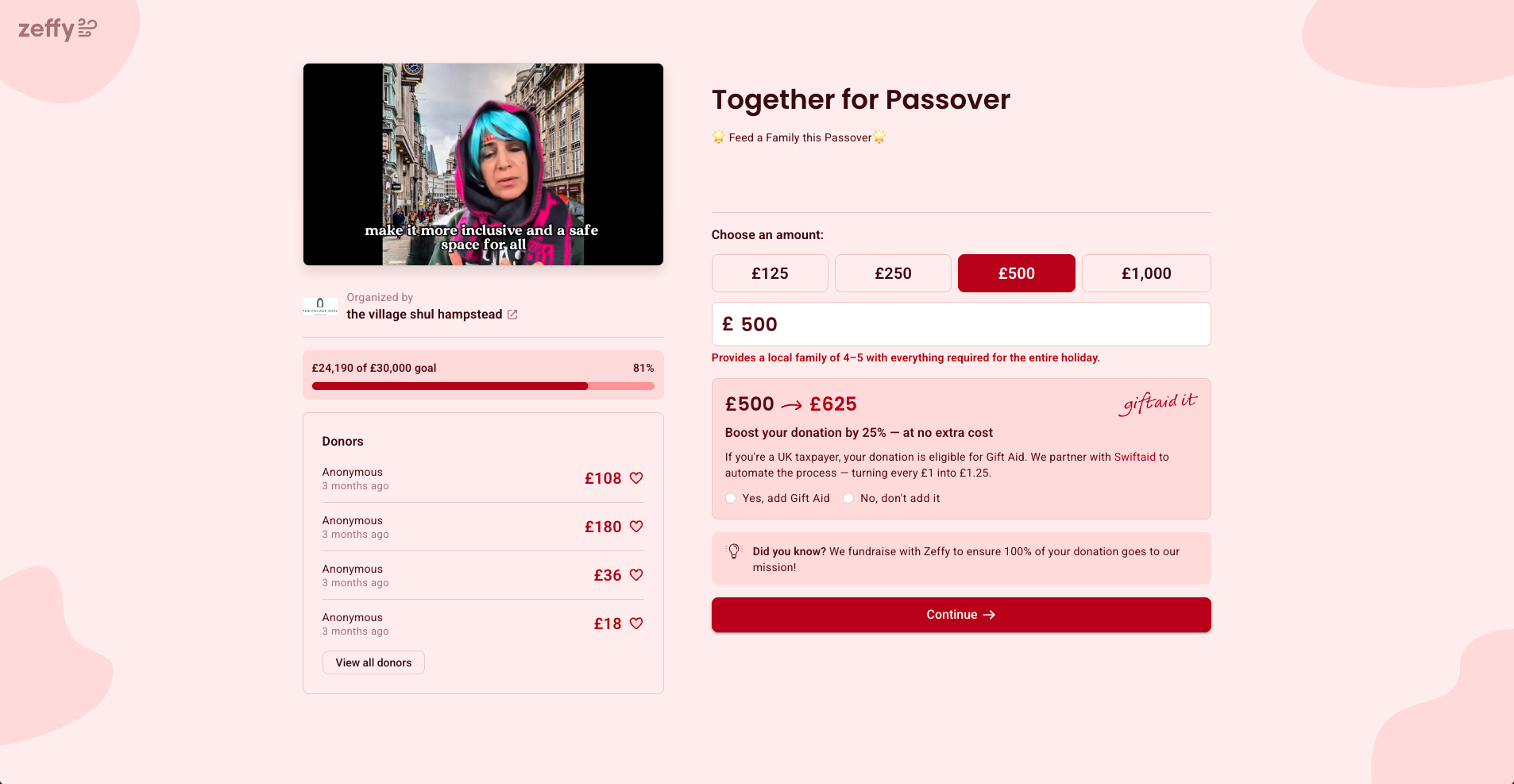
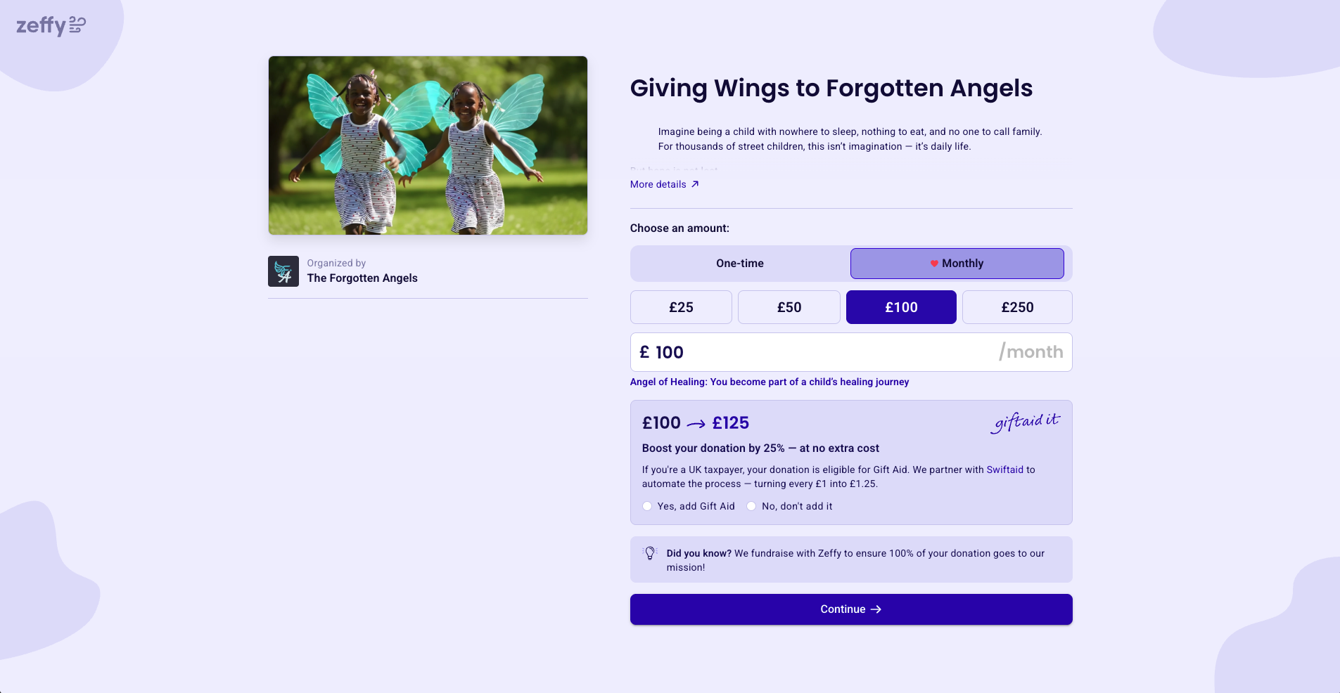
Gift Aid declaration: include a Gift Aid checkbox on your form. A UK taxpayer's £100 gift becomes £125 to your charity via Gift Aid, at no extra cost to the donor. They simply confirm they have paid enough UK income or capital gains tax and provide their name and home address (HMRC Gift Aid guidance).
Customised questions: mark fields as 'optional' or 'required' to add clarity throughout the form.
Preset donation amounts: suggest specific giving amounts by default to guide donors, with the option to enter their own figure.
Modern payment options: help donors complete their gift using major debit and credit cards, Apple Pay, Google Pay, Direct Debit (via GoCardless or similar, the standard route for regular giving in UK charities), and Open Banking 'Pay by Bank' for one-off gifts.
The best way to spark ideas is to look at examples from other charities. The following sites from leading UK charitable organisations show different approaches to design, content, and calls to action. At the time of writing, each of these organisations illustrates a distinct principle worth borrowing.
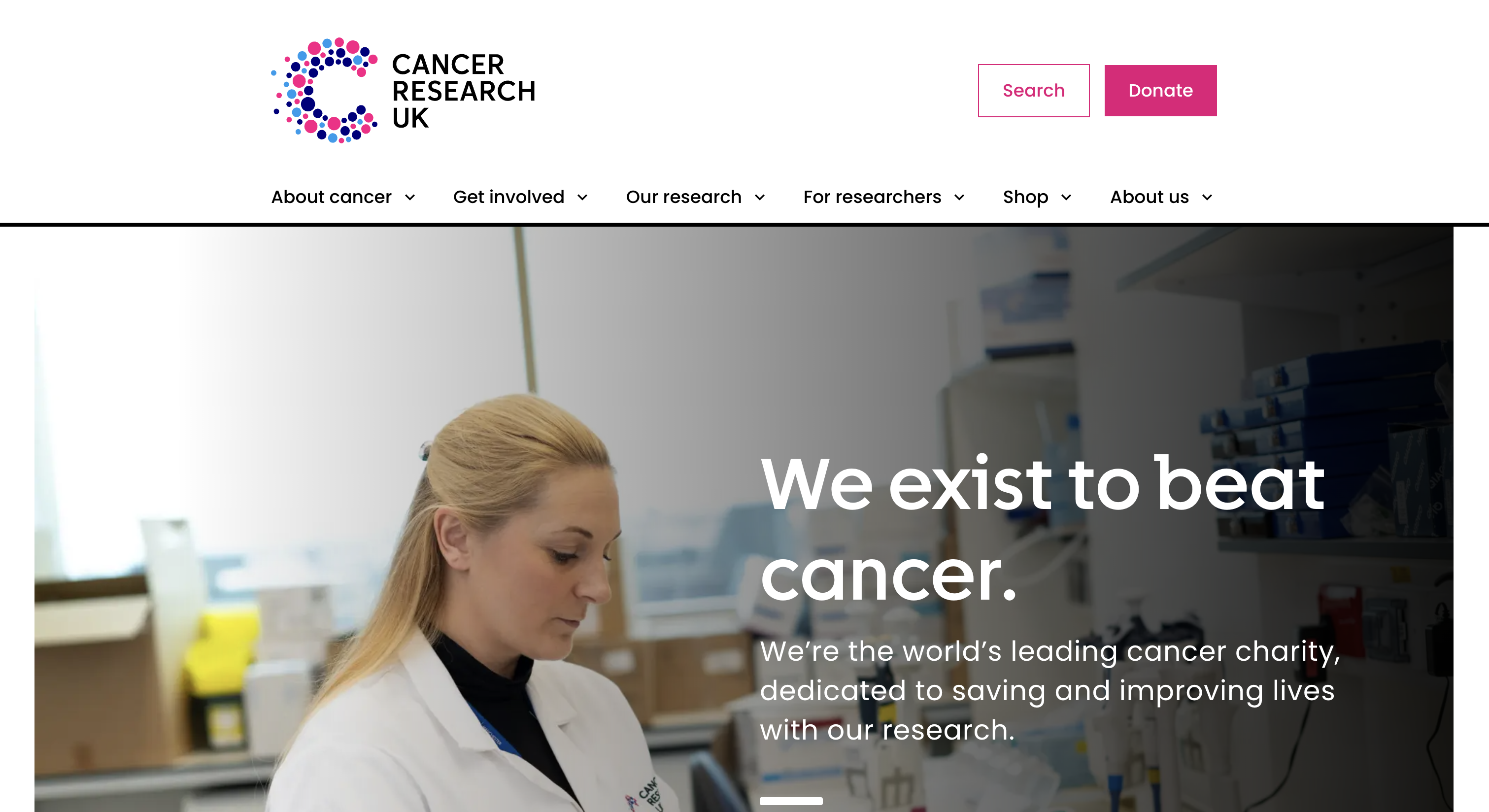
1. Cancer Research UK, outcome-led simplicity
Cancer Research UK sets the standard for restrained, effective charity web copy. The homepage leads with a short, declarative headline and a prominent 'Donate now' button, with a clear route to monthly giving immediately below. There are no stacked adjectives and almost no exclamation marks in the body copy. The footer carries the registered charity number and the Fundraising Regulator badge on every page.
Inspiration for your charity website:
Lead with a short, outcome-focused headline rather than a list of services.
Place your most important call to action, 'Donate now' or 'Donate today', where it cannot be missed.
Offer a monthly giving option close to your primary donate button.
Display your charity number and Fundraising Regulator badge in the footer of every page.
Use colour choices that align with your brand, not a generic template.
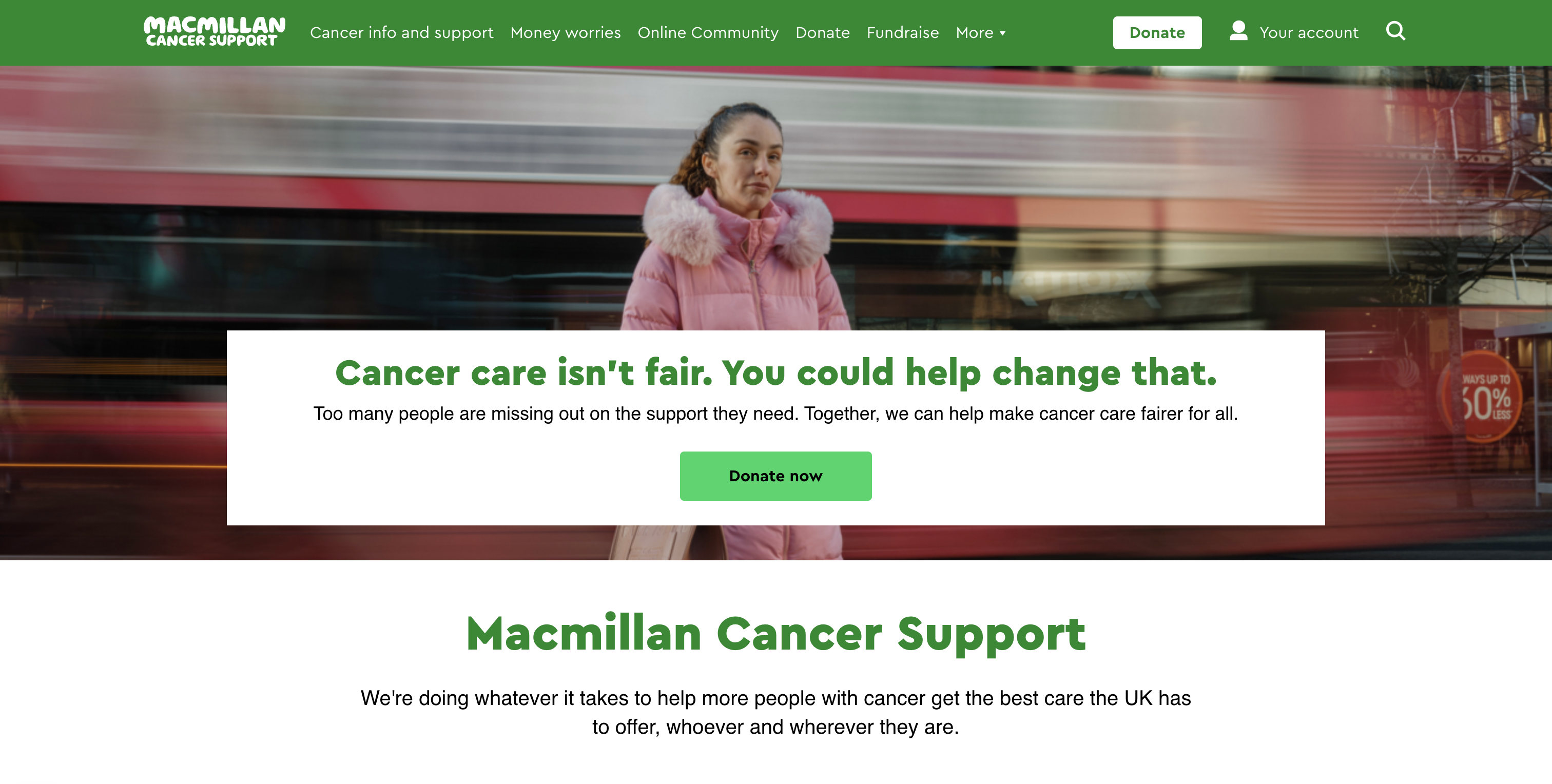
2. Macmillan Cancer Support, one sentence that does the work
Macmillan Cancer Support demonstrates how much a single well-crafted sentence can achieve. The hero section uses plain, short language with a clear call to action and an easy route to Gift Aid information. The site makes it straightforward to find practical support, donate, or get involved in fundraising without unnecessary steps.
Inspiration for your charity website:
Use one strong declarative sentence in your hero section rather than a long paragraph.
Link to Gift Aid information prominently on your donation pages.
Design separate journeys for people who want to receive support and people who want to give.
Keep navigation labels plain and descriptive; avoid clever but ambiguous wording.
Use short paragraphs and plenty of white space to make each page feel approachable.
3. RSPCA, trust signals front and centre
The RSPCA uses 'supporter' language throughout the site and puts trust signals where visitors look for them. The footer displays the registered charity number, the Fundraising Regulator badge, and a link to the privacy policy. The site builds confidence before asking for anything.
Inspiration for your charity website:
Use 'supporter' and 'donor' as your primary audience terms; they are the terms UK charity audiences recognise and trust.
Make your registered charity number, Fundraising Regulator badge, and privacy notice easy to find in the footer.
Feature monthly sponsorship and regular giving options prominently, not just one-off donations.
Use authentic photographs of the people and animals your work benefits to build real emotional connection.
Keep the tone declarative and warm, not pleading.
4. Oxfam GB, plain verbs, clear navigation
Oxfam GB demonstrates the power of verb-led calls to action. The main CTAs are short and direct, for example 'Donate now', 'Sign the petition', 'Shop'. The navigation puts campaigns first, making it easy for visitors to find an action that suits them, from donating money to buying second-hand goods.
Inspiration for your charity website:
Use short verb-led CTAs such as 'Donate now', 'Buy now', and 'Sign up'; avoid 'Click here to give'.
Feature different types of engagement (donations, petitions, shopping) in the navigation so visitors can find their preferred route.
Brand your campaigns clearly with distinct images and headlines.
Make it easy to switch between giving money and giving time.
Include a newsletter sign-up on the home page to stay in touch with visitors who are not ready to give today.
5. British Red Cross, appeal cards and peer-to-peer framing
The British Red Cross uses clear appeal cards on the home page to route visitors to the right campaign quickly. Peer-to-peer fundraising is framed as 'Join Team Red Cross', sitting alongside individual donation options and making it easy for supporters to choose how they want to help. Short, action-oriented copy runs throughout the site.
Inspiration for your charity website:
Use appeal cards on the home page to signpost visitors to different campaigns without clutter.
Frame peer-to-peer fundraising as 'joining a team' to make it feel inclusive and motivating.
Keep appeal copy short: one headline, one sentence, one button.
Make emergency appeals easy to find without burying your everyday giving options.
Test a tabbed or rotating appeal section if you run more than two active campaigns at once.
Complete the experience with Zeffy
Your charity website is a powerful tool to attract new donors, nurture connections, and retain loyal supporters. Many small UK charities are currently stitching together four or five separate tools: JustGiving for donations, Ticket Tailor for events, Crowdfunder for campaigns, and a separate CRM. Your website is where all those tools collide, and each seam is a point where a donor can drop off.
Zeffy brings together donations, event ticketing, memberships, raffles, auctions, and donor management in one free platform, with Gift Aid support built in. There is no platform fee, no transaction fee, and no credit card fee, ever. Over 100,000 charities worldwide have raised more than £2bn through Zeffy without paying a penny to the platform.
Once you have built a site you are proud of, connect your Zeffy donation and campaign pages to match its look and feel. That way, every supporter sees a consistent experience from your home page right through to the confirmation, and every pound goes to your cause.
Get weekly fundraising tips from nonprofits experts
Thank you! Your submission has been received!
Oops! Something went wrong while submitting the form.
Keep reading :
Nonprofit software
Best Website Builders for UK Charities (2026)
Choosing the right website builder helps your charity raise more and reach more supporters. This guide compares nine free or low-cost options, from Zeffy's all-in-one free fundraising platform to Wix, Squarespace, WordPress, and more, with UK pricing, Gift Aid considerations, and the trust signals donors expect.
Look for people who attend related events, follow relevant Facebook groups, or subscribe to aligned newsletters.These aren’t just potential donors—they’re your future advocates.
Look for people who attend related events, follow relevant Facebook groups, or subscribe to aligned newsletters.These aren’t just potential donors—they’re your future advocates.






.png)


.webp)

